UX experiments / Persuasion
Persuasion · A/B test series
Long feature page or big customer photo? Highrise's signup test
Signup page: a long page that explains every feature, or a short page led by a big photo of a smiling customer?
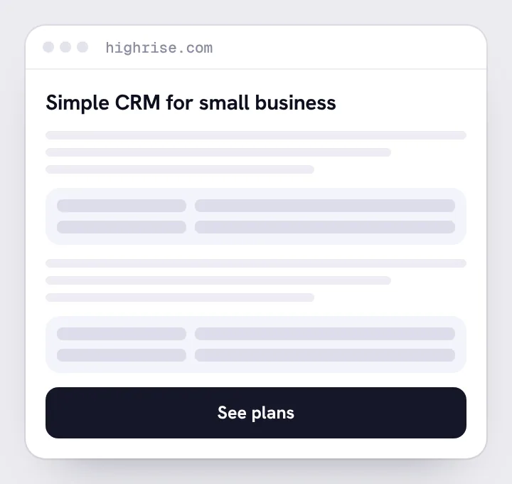
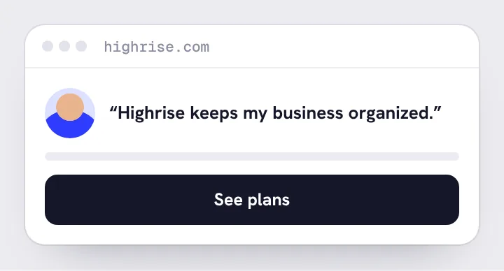
Make your call. Which version won, and why? Decide before you open the result. Guessing first is what trains your judgment.
Made your call? See the result
The short person page got 47% more paid signups than the long form.
What happened
It had far less information about the product. The team found that which specific person appeared mattered less than the big, human photo itself.
Why it worked
A human face and a smaller page made the decision feel lighter.
The takeaway
Explaining more isn't persuading more. Cut until it hurts, then test.
Source
- Signal v. Noise · A/B testing at Highrise (signalvnoise.com)
More experiments to call
Practice the call
Call experiments like these every day.
Irreplaceable gives you a few real experiments a day to call before you see the result, and tracks how your judgment improves. Start with a free baseline: 12 decisions, about 12 minutes.